mirror of
https://codeberg.org/forgejo/forgejo.git
synced 2025-10-31 06:21:11 +00:00
 b9baed2c74
This PR introduces a new UI element type for Gitea called `flex-item`. It consists of a horizontal card with a leading, main and trailing part:  The idea behind it is that in Gitea UI, we have many cases where we use this kind of layout, but it is achieved in many different ways: - grid layout - `.ui.list` with additional hacky flexbox - `.ui.key.list` - looks to me like a style set originally created for ssh/gpg key list, was used in many other places - `.issue.list` - created for issue cards, used in many other places - ... This new style is based on `.issue.list`, specifically the refactoring of it done in #25750. In this PR, the new element is introduced and lots of templates are being refactored to use that style. This allows to remove a lot of page-specific css, makes many of the elements responsive or simply provides a cleaner/better-looking way to present information. A devtest section with the new style is also available. <details> <summary>Screenshots (left: before, right: after)</summary> 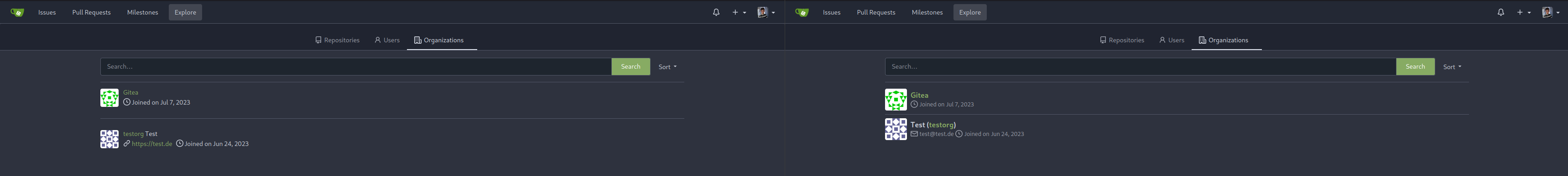  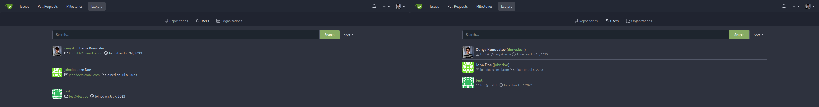  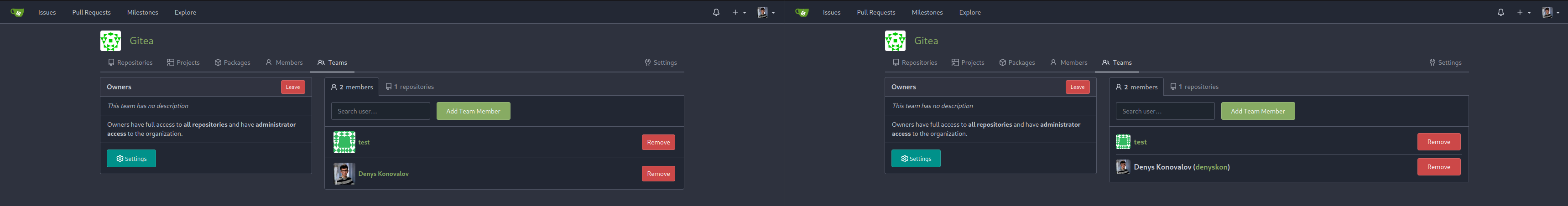          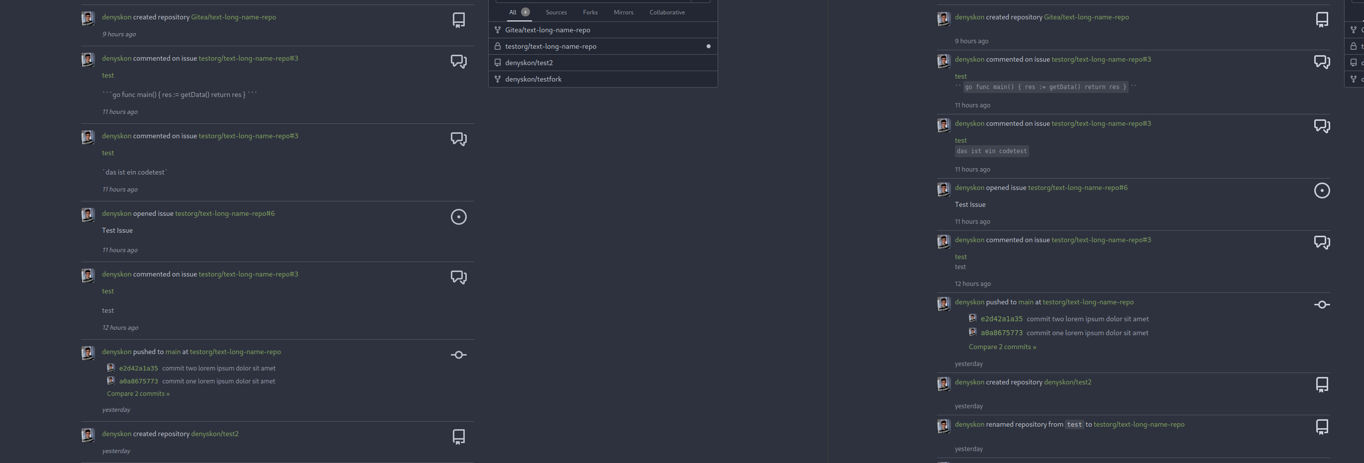  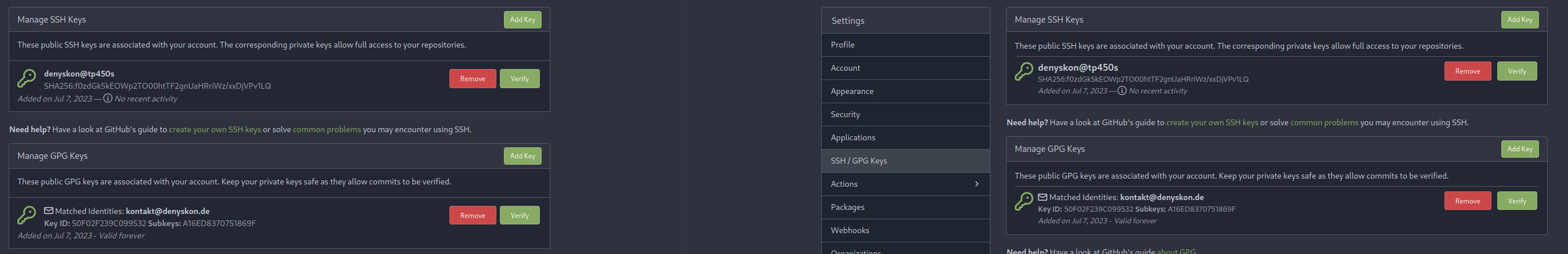  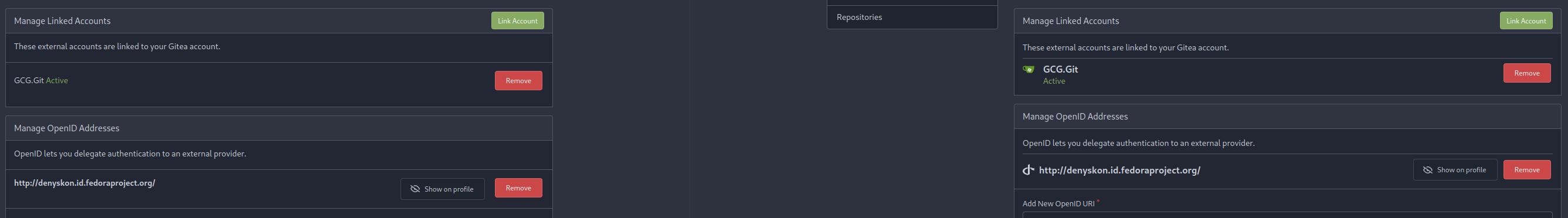 </details> --------- Co-authored-by: Giteabot <teabot@gitea.io>
67 lines
No EOL
1.3 KiB
CSS
67 lines
No EOL
1.3 KiB
CSS
.issue-list-toolbar {
|
|
display: flex;
|
|
flex-wrap: wrap-reverse;
|
|
justify-content: space-between;
|
|
align-items: flex-start;
|
|
gap: 1rem;
|
|
margin-top: 1rem;
|
|
}
|
|
|
|
.issue-list-toolbar-left {
|
|
display: flex;
|
|
}
|
|
|
|
.issue-list-toolbar-right .filter.menu {
|
|
flex-direction: row;
|
|
flex-wrap: wrap;
|
|
}
|
|
|
|
@media (max-width: 767.98px) {
|
|
.issue-list-toolbar-right .dropdown .menu {
|
|
left: auto !important;
|
|
right: auto !important;
|
|
}
|
|
.issue-list-navbar {
|
|
order: 0;
|
|
}
|
|
.issue-list-new {
|
|
order: 1;
|
|
margin-left: auto !important;
|
|
}
|
|
.issue-list-search {
|
|
order: 2 !important;
|
|
}
|
|
}
|
|
|
|
#issue-list .flex-item-body .branches {
|
|
display: inline-flex;
|
|
}
|
|
|
|
#issue-list .flex-item-body .branches .branch {
|
|
background-color: var(--color-secondary-alpha-40);
|
|
border-radius: 3px;
|
|
padding: 0 4px;
|
|
}
|
|
|
|
#issue-list .flex-item-body .branches .truncated-name {
|
|
white-space: nowrap;
|
|
overflow: hidden;
|
|
text-overflow: ellipsis;
|
|
max-width: 10em;
|
|
}
|
|
|
|
#issue-list .flex-item-body .checklist progress {
|
|
margin-left: 2px;
|
|
width: 80px;
|
|
height: 6px;
|
|
display: inline-block;
|
|
border-radius: 3px;
|
|
}
|
|
|
|
#issue-list .flex-item-body .checklist progress::-webkit-progress-value {
|
|
background-color: var(--color-secondary-dark-4);
|
|
}
|
|
|
|
#issue-list .flex-item-body .checklist progress::-moz-progress-bar {
|
|
background-color: var(--color-secondary-dark-4);
|
|
} |